Also, the study of psychological processes which underlie aesthetic response.
The word comes from the Greek `aisthetikos', meaning `of sense perception.'
People studying aesthetics seek to understand why some things produce positively valued reactions whereas others arouse negatively valued ones.
Why are we drawn to certain images and artefacts and repelled by others?
Very hard question.... but of central importance for GC.
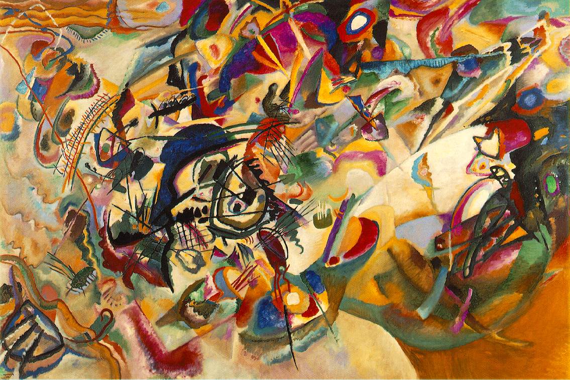
Kandinsky
Just a matter of taste?
Different cultures show specific likes and dislikes.
Western societies more interested in `zooming in' on detail.
Eastern societies more responsive to plenty of context.
Is aesthetic experience a completely subjective property?
To a considerable degree, people do tend to respond in similar ways.
But this doesn't seem to get even close to the kinds of extremely delicate discriminations that people make between `attractive' and `not attractive'.
It's tempting to dismiss differences in response as purely subjective/culturual/social.
But the consistency shown in making context-free judgements suggests some more objective basis.
Semir Zeki's work at UCL has demonstrated relations between certain abstract works of visual art and neurones in the brain that detect movement, direction and colour.
Novelist A S Byatt, writing in the Times Sep 22 2006, speculates that in the case of aesthetic response to narrative and poetry this `lighting up' may be the activity of mirror neurons (cells in the frontal lobes of monkeys which fire not only when the monkey performs an action, but when it observes the same action performed by another.)
And the link seems to work both ways....
Research which combines fMRI scanning with traditional questionaire methods has suggested that `creative types' have trademark patterns of brain activity, such as ``significantly higher activation in right and left cerebellum and in right and left frontal and temporal lobes, confirming inter-hemispheric interactions'' when engaged in a creative task.
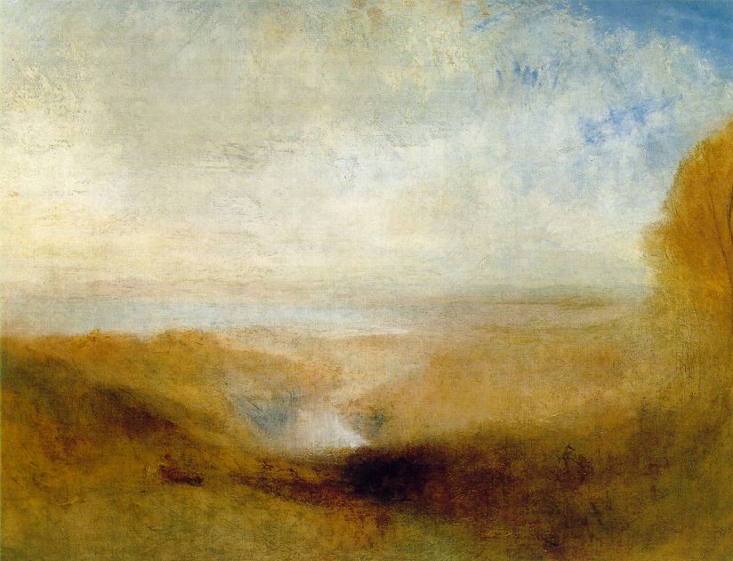
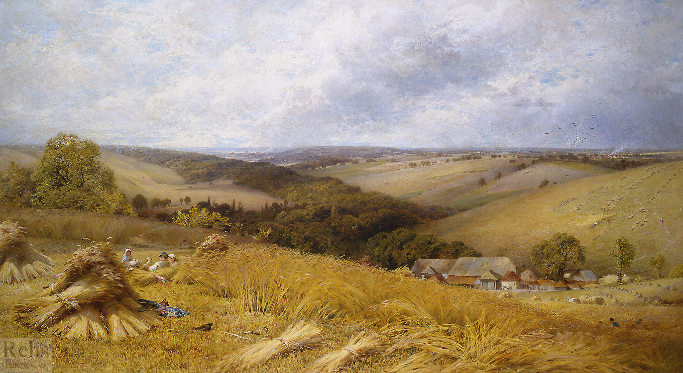
Critical objects fully visible, not obscured by clutter, in the centre, informative lighting textures, clustering of salient entities etc.
But breaking such basic `rules' then becomes the means of achieving a different sort of aesthetic property, e.g., Bush pictured disapearing off the edge of the picture in a recent Time magazine cover.
These are essentially formalizations of preferences for colour combinations.
Key principle of `hue similarity', i.e,. we tend to prefer combinations of close hues.
But with `cool' colours there is more tolerance (where cool equates to saturation or intensity).
Principles of contrast, e.g., warm colours systematically preferred on cool backgrounds.
But significant variation in the degree to which people prefer harmonious colors.
Indeed, some people highly prefer contrastive colours.
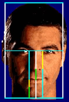
In particular, the golden ratio.
Two values are in the golden ratio if the ratio between them is equal to ratio between sum and largest value.
Also known as the `divine proportion', `golden mean', `golden section.'
This ratio observed in large-scale constructions from the ancient world, e.g., Giza pyramids and the parthenon.
and the face...
Is there any connection between preference for colour harmony and preference for tonal harmony?